Toblerone Mountain: A Sweet Shift in Swiss Chocolate Branding
Introduction
Toblerone, the renowned Swiss chocolate brand, has long been synonymous with quality, tradition, and the iconic Matterhorn/Toblerone mountain. However, a recent shift in its packaging has stirred both intrigue and nostalgia among chocolate enthusiasts worldwide.
In this article, we delve into Toblerone’s rich history, exploring its roots in Swiss culture and its distinctive triangular shape that has delighted consumers for generations. Moreover, we unravel the significance of the Matterhorn mountain on Toblerone’s packaging, tracing its presence back to 1970 and its role in shaping the brand’s identity.
Join us on a journey through Toblerone’s mountainous branding landscape as we uncover the reasons behind the recent change and reflect on its implications for this beloved chocolate icon.

Toblerone History
Since its inception, Toblerone has been a beacon of Swiss craftsmanship and chocolate excellence. The story begins in 1908 when Theodor Tobler and Emil Baumann, inspired by the Swiss Alps, crafted a unique chocolate bar with a distinctive triangular shape. This innovative design not only set Toblerone apart in the crowded chocolate market but also paid homage to the majestic peaks of Switzerland.
The brand’s name itself is a clever fusion of “Tobler” from the Tobler family and “torrone,” the Italian word for nougat, reflecting the bar’s nougat filling. Over the years, Toblerone’s popularity soared, becoming an integral part of Swiss culture and a cherished souvenir for tourists visiting the country.
Central to Toblerone’s allure was its iconic packaging, adorned with the striking silhouette of the Matterhorn mountain. Towering at 14,692 feet, the Matterhorn symbolized the beauty and grandeur of the Swiss Alps, evoking a sense of adventure and luxury with every chocolate bar.
As Toblerone continued to thrive, its triangular shape became synonymous with indulgence, making it a staple in households worldwide. The brand’s commitment to quality and innovation propelled it to international acclaim, cementing its status as a quintessential Swiss delicacy.
Throughout its history, Toblerone has remained true to its roots, honoring the traditions and heritage that define Swiss chocolate craftsmanship. However, recent changes in Toblerone’s packaging signal a new chapter in its storied history, prompting reflection on the brand’s evolution and the significance of its mountainous motif.
The Matterhorn Logo
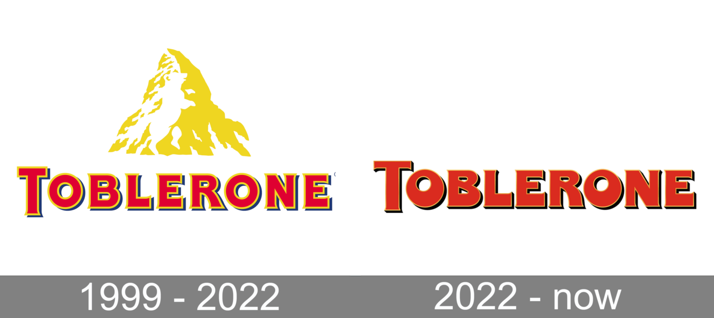
Central to Toblerone’s identity has been its iconic Matterhorn logo, which adorned its packaging since 1970. The Toblerone Mountain, with its distinctive pyramid shape and imposing presence, served as more than just a symbol; it encapsulated the essence of Swiss heritage and natural beauty.
For decades, the Matterhorn logo acted as a beacon, drawing consumers into Toblerone’s world of exquisite chocolate craftsmanship. Its inclusion on packaging was not merely decorative but imbued each bar with a sense of authenticity and premium quality. The image of the Matterhorn evoked feelings of nostalgia and wanderlust, transporting consumers to the picturesque landscapes of the Swiss Alps with every bite.
Beyond its aesthetic appeal, the Matterhorn logo reinforced Toblerone’s commitment to its Swiss roots and the tradition of excellence that the brand represented. It became a recognizable hallmark of quality, trusted by chocolate connoisseurs worldwide.
Moreover, the Matterhorn served as a point of connection between Toblerone and its consumers, sparking curiosity and conversation. Whether displayed on supermarket shelves or tucked away in travelers’ suitcases, the Matterhorn logo became a familiar sight, synonymous with indulgence and luxury.
However, as Toblerone navigates changing landscapes and production shifts, the decision to remove the Matterhorn from its packaging marks a significant turning point in the brand’s history. It prompts reflection on the role of symbols in branding and the delicate balance between tradition and innovation. As Toblerone embraces a new logo while retaining its geometric and triangular aesthetic, it opens the door to a fresh chapter in its journey—one that pays homage to its past while embracing the opportunities of the future.
Changes in Packaging – No More Toblerone Mountain
In response to shifting production dynamics and the need to comply with Swiss laws regarding national symbols, Toblerone recently announced significant changes to its packaging. The decision to remove the iconic Toblerone mountain from the packaging represents a departure from decades of tradition and a pivot towards a new era for the brand.
Mondelez International, Toblerone’s parent company, stated that the adjustments were necessary to adhere to Swiss regulations while accommodating increased demand and production changes. This move underscores the complexities that multinational corporations face when navigating cultural sensitivities and regulatory frameworks across different markets.
The introduction of a new mountain logo, retaining Toblerone’s signature geometric and triangular aesthetic, represents a strategic evolution in the brand’s visual identity. While the Matterhorn may no longer grace Toblerone’s packaging, the essence of the Swiss Alps and the spirit of adventure they evoke remain intrinsic to the brand’s DNA.
This shift in packaging reflects Toblerone’s commitment to adaptability and resilience in an ever-changing global landscape. By embracing change while staying true to its heritage, Toblerone reaffirms its position as a leader in the chocolate industry, poised to captivate consumers for generations to come.
However, the removal of the Matterhorn from Toblerone’s packaging also raises questions about the role of symbols in branding and the potential impact on consumer perceptions. Will loyal fans embrace the new mountain logo with the same fervor as its predecessor? Only time will tell as Toblerone embarks on this new chapter in its branding journey.

Impact and Reactions
The announcement of brand’s packaging changes, particularly the removal of the Toblerone mountain, has sparked a range of reactions among consumers and chocolate enthusiasts worldwide. For many, the Matterhorn symbolized more than just a mountain; it represented a connection to Swiss culture, tradition, and the premium quality associated with Toblerone chocolate.
Some consumers have expressed nostalgia and disappointment at the prospect of saying goodbye to the iconic Matterhorn logo. For them, the image was not merely decorative but held sentimental value, evoking memories of shared moments and fond experiences associated with Toblerone chocolate.
Others have voiced curiosity and intrigue about the new mountain logo and its implications for Toblerone’s brand identity. While change can be met with resistance, it also presents an opportunity for renewal and reinvention. The introduction of a new logo opens the door to fresh interpretations and storytelling possibilities, inviting consumers to rediscover Toblerone in a new light.
Additionally, the removal of the Matterhorn from Toblerone’s packaging underscores the complexities of branding in a globalized world. As brands navigate cultural sensitivities and regulatory frameworks across different markets, they must strike a delicate balance between tradition and adaptation. Toblerone’s decision reflects a pragmatic approach to compliance while remaining committed to its core values and heritage.
Ultimately, the impact of Toblerone’s packaging changes will be measured by consumer acceptance and market performance. As the new mountain logo makes its debut on store shelves, Toblerone faces the challenge of winning over loyal fans while attracting new audiences. How consumers respond to this branding evolution will shape Toblerone’s trajectory in the competitive chocolate industry for years to come.
Conclusion
Toblerone’s decision to change its packaging, including the removal of the iconic Matterhorn mountain, marks a significant milestone in the brand’s history. As a beloved symbol of Swiss chocolate craftsmanship and tradition, Toblerone has captured the hearts of consumers around the world for generations.
The introduction of a new mountain logo reflects Toblerone’s commitment to adaptability and innovation in the face of evolving consumer preferences and market dynamics. While the decision may evoke nostalgia among some consumers, it also presents an opportunity for Toblerone to refresh its brand identity and connect with audiences in new and meaningful ways.
As Toblerone navigates this branding evolution, it remains rooted in its Swiss heritage and the values that have defined the brand since its inception. By striking a balance between honoring tradition and embracing change, Toblerone reaffirms its position as a leader in the chocolate industry, poised to delight consumers for years to come.
Ultimately, the success of Toblerone’s packaging changes will hinge on consumer acceptance and engagement. As the new mountain logo graces Toblerone’s packaging, it invites consumers on a journey of rediscovery, inviting them to savor the same delicious chocolate with a fresh perspective.
In this ever-changing landscape of branding and consumer preferences, Toblerone’s willingness to adapt while staying true to its heritage sets a precedent for brands seeking to navigate the complexities of a globalized world. As Toblerone continues its journey, one thing remains certain: the spirit of adventure and indulgence embodied by Toblerone chocolate will endure, transcending borders and generations alike.


 Littauerboden 1 CH-6014, Luzern Switzerland
 info@swissmade.direct

